Decorate Like A Pro With These 14 Easy Personal Touches To Your Home Decor
Have you ever wondered what is it that makes professionally decorated home look so aesthetically right? After all, personal taste plays a big part in what you find beautiful and yet even if you don’t agree with everything a designer does, it does always look professional.
Today, we’re going to reveal some designer secrets, so to speak, that will help you make your home decor look like it was designed by a pro with just a few tweaks.
Find the Anchor

Source: myscandinavianhome.blogspot.com
An anchor in home decor is an accent item that brings everything together. It can be a couch in accent color, a table, a piece of art, a colorful rug, or even just a bunch of throw pillows. The important thing about an anchor is that you have to choose one first and then decorate around it.
Balance Patterns and Solids

Source: chinoiseriechic.blogspot.com
Solid colors may be boring but too many busy patterns make the place look cluttered. The key is finding the balance between the two. So for every pattern item you add, make sure there’s enough solid color in the room to balance it out. Make sure they don’t compete but compliment each other.
Mix Metallic and Colors

Source: styleblueprint.com
Mixing metallic finish and colors is a trick of trade for many designers. Brass fixtures and dark cabinets add a lot of depth, especially when contrasted with bright walls.
Combine Different Pieces

Getting furniture in sets is not what professional designers do. Truly beautiful decor is made of combining different pieces to create something unique.
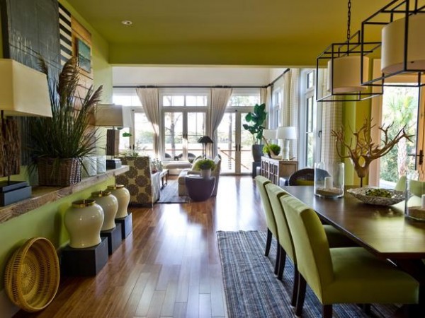
Mind the Sight Lines

Source: www.hgtv.com
The key to maintaining a balance and natural flow of furniture in a room is planning for the sight lines. Each room has a path to the door, windows and seating, make sure that path is not obstructed.
Make a Gorgeous Bathroom

Source: decoholic.org
It’s easy to forget the bathroom but your home decor is not complete if your bathroom is a mess. Make it look gorgeous.
Add Seating to the Bedroom

Even if your bedroom is small, find some room for a chair and it will look bigger and more complete.
Use Lacquered or Mirror Trays

Source: honeywerehome.blogspot.ca
Elevate your vignettes by using lacquered or mirror trays.
Layer the Lighting

Source: ohbythewayblog.blogspot.nl
Layering the lighting is the number one tool of romantic design. Use table and floor lamps to add layers and find the right lighting. Remember, everything looks better in the right light.
Soften the Edges

Source: thediversionproject.blogspot.com
Add houseplants, floor lamps or even create vignettes in the corners of a room to soften the edges, add depth and make it look bigger.
Use Symmetry

Source: www.houzz.com
Use matching chairs or pictures alike to add symmetry to the room and make it look well balanced and important.
Draw Attention with Eye Catchy Pieces

Source: www.harpersbazaar.com
This tip is especially useful in a room that starts looking cluttered. When there’s a lot going on and several pieces compete to be the anchor, add something eye catchy to direct the attention the way you want.
Break the Tension with Books

Source: www.homebunch.com
Sometimes the room’s decor may become too strict. A very quick and easy to break the tension is to add bundles of books around.
Embrace the Rule of Thirds

Source: www.cuckoo4design.com
You may know that things look most visually pleasing when they come in threes. The reason behind that is actually the rule of thirds or the golden ratio that’s the staple of design. To put it simply, divide a space in thirds and use one third as the focal point. So besides creating vignettes of three objects (or groups of objects) you have to make sure they aren’t all alike and make one piece the accent.
You can use this rule in any aspect of home decor, from painting the walls, to furniture arrangement, hanging wall art, and arranging accessories.
via ISD

No Comments