Cool Design: Tour This Modern Prefab Loft Home
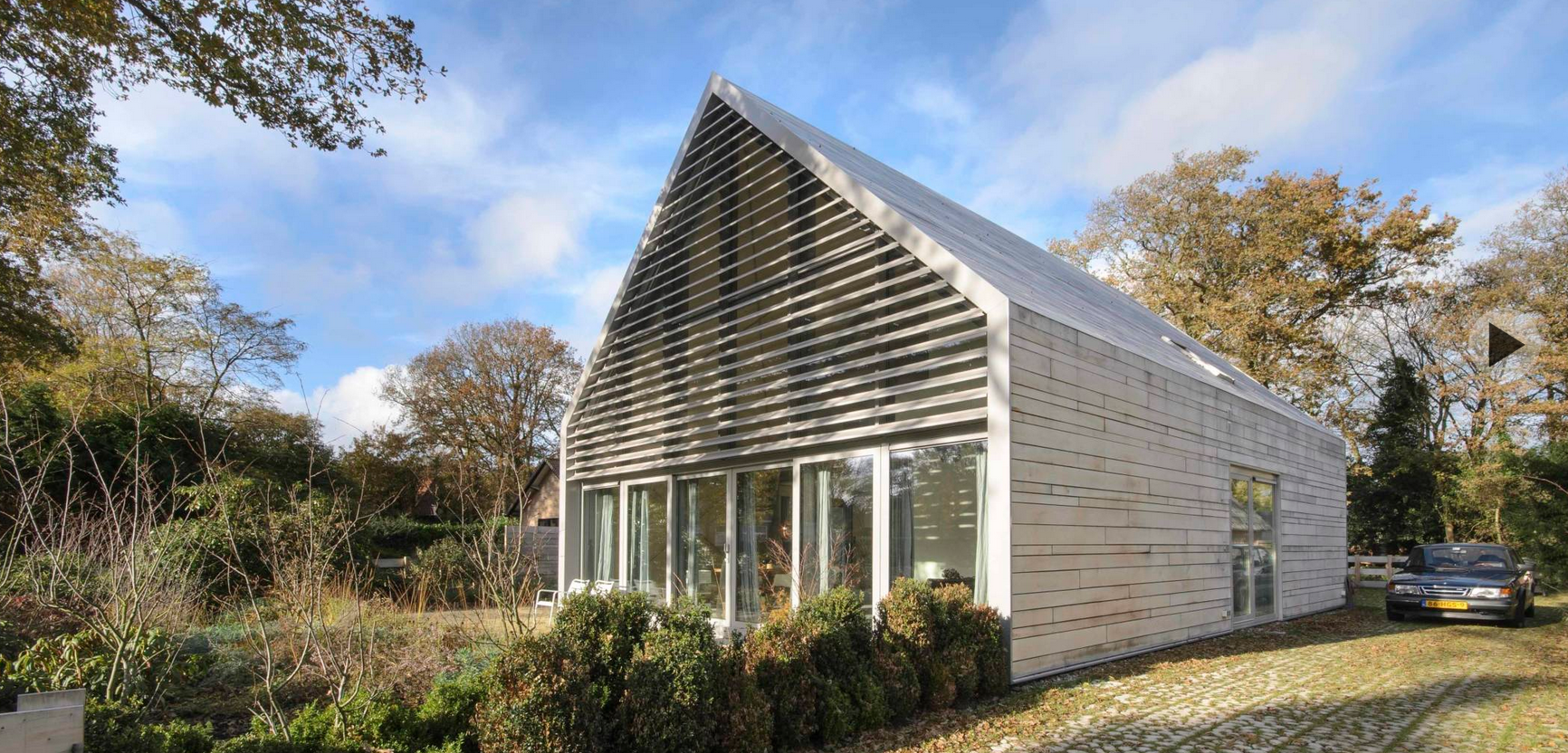
Looking at the exterior of the house we are mesmerized by the glazing and the oak exterior. Pieces of oak have been mixed and stacked together to form the exterior walls of the home. The classic shape and gable roof mean that the home has perfect lines.
Those horizontal shapes are blinds on the home that can be open or closed to let in light. The entirety of this wall of the home is glazed. We love how the home faces the sun to bring in lots of light! It’s clear even from the exterior that this is a bright and airy home.

Stepping inside the home we take our first look at the dynamic living room. Neutral shades combine with classic black and white. Copper accessories give the home a touch of luxury. The interior walls are simple plywood. When they combine with the x-shaped support beams the look is chic. Despite a modest square footage in the home, there is lots of open space and breathing room.

From this angle we can see the kitchen that’s tucked under the mezzanine. A linear arrangement means that the kitchen takes up a small space. It’s also easy to keep a small kitchen clean! Minimalist lighting and fixtures mean that the kitchen is functional and orderly.
Next to the kitchen is a dining and living area that has been gracefully combined. Furnished with natural fabrics and materials, the room has a lot of texture. The layered rugs are a cool choice. Bare walls like this can make a place feel more expansive and make you pay attention to the innovative building materials.

A view from the loft looking down into the main room gives us a sense of the volume in this house. The glazing with its smart blinds is the most incredible feature of the home. Opening your home with glazing to the outdoors is freeing. It means that your home will be well lit with natural light.
We love the combination of blinds and curtains because they can adapt to suit your privacy. The bold black and white rug works well in the room, giving it a stylish anchoring focal point.

The owners have decided to have their bedroom on the main floor of the home. This is a great choice if you live with other people. You can putter around in the kitchen without disturbing someone sleeping in the loft! The plywood panel in the bedroom here looks like a sophisticated choice. It seems to form a headboard for their bed.
While the living room lacked colour, the bedroom is host to a grey-blue bedspread. This is a chic colour for the bedroom and helps promote a calming feeling. Floor to ceiling windows in the bedroom let in lots of light and make the room appear larger. We love the effortlessness of this bedroom!

One last peek at the living room before we head upstairs. This angle shows off perfectly how the blinds work to filter the light entering the home. The metal beams and roof angles create visual interest while the concrete floors seem to be absorbing the warmth from the sun. Bare, minimalist stairs lead up to the mezzanine. Let’s go take a look!

Upstairs in the mezzanine is the office. Sparsely decorated with a folksy rug and office desk, this is an inspiring workspace. A track of lighting just like we saw downstairs illuminates the office. The severe angles of the roof create a cozy feeling inside. The desk is massive and accommodates all the fixings of a modern office space.
Minimalist aesthetic up here means that distractions are kept to a minimum. There is little to do in the way of cleaning; no bookshelves to dust and few surfaces to wipe down. Imagine working here with views of the treetops and plentiful natural light!

via Homify

No Comments