From Rundown Farmhouse To Modern Villa
This farm was scruffy and outdated, but thanks to the brilliant work of professionals Studio 06, it has been magically transformed into a sophisticated and modern villa.
The home is featured on two floors, with a strong element that links to the two spaces together: a large red column that runs through both floors.
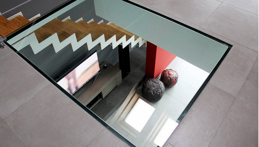
The original building has been extensively remodeled, with the introduction of large glazed windows to the living area as well as a glazed floor upstairs, which allows light to shine through this beautiful home.
Before

Before the renovation, this home looked like an old farmhouse. It was in definite need of a renovation as well as a more modern look and feel, because while farmhouses have their charm, this one lacked character and was in need of something extra!
After

With the renovation, the home has completely changed in appearance. The architects have preserved some of the fundamental and unique elements from the old home, such as the ceiling beams that emerge from the facade, while the rest of the space has taken a quantum leap and been completely modified.
The large windows help give that modern look as well as create a very bright and spacious looking living room. This makes for a very pleasant home!

The atmosphere that was created in the living area of the house is extremely refined – there are no traces of the previous neglect.
The color choices could not be more spot on. The white ceiling gives a very light touch to this space, while the grey and black walls add elegance. Here we can also see that red column we mentioned before, which runs up through the home. The red is very strong, giving this space lots of character.
The clock detail adds an extra touch of style to the room.
This is a space that shows us why it’s so important to pay attention to detail. Every element in this space has been strategically placed for the perfect overall effect.
Have a look at these: Tips for boosting your living room on a budget.

This part of the home is devoted to the kitchen and dining area and evokes a strong Scandinavian atmosphere.
Here there are no strong colors, with the designers opting for white walls and dark wood in the form of the ceiling beams.
The dining room table is a massive square, bringing a modern and elegant feature to the room. Don’t you love the grey chairs, made in the transparent plastic material? Very retro!
The kitchen features dark wood, which matches the ceiling beams, and is very similar to a traditional minimalist kitchen. Yet it also features a little quirky touch thanks to the ladder, which functions as a storage spot for dish towels.
This is a great example of how a space can feature a contemporary twist!

As we said before, one of the most incredible features when it comes to this home is the glass window slab in the floor between the first and second levels. This piece of glass offers visual continuity between the two floors and allows light to filter through this space.
via Homify

No Comments