Cool Design: Couple Transforms Old Chocolate Factory Into Modern Loft
100 years after the MacRobertson Chocolate Factory in Australia was completed, a couple purchased the factory in hopes of turning it into a loft. They turned to Albert Mo, director of Melbourne-based Architects EAT. The goal: help turn the bare, industrial space into a home.
Upon visiting the factory for the first time, Mo felt quite overwhelmed. His team would have to achieve a number of seemingly contradictory goals: creating a cozy, not cavernous, home while highlighting the loft’s amazing height; paying tribute to industrial quality while making the home luxurious, and bringing the space into the 21st century while preserving the beauty of its past.

“The challenge lies in how to create a home-y feel while respecting the industrial history,” Mo says. “We sought to bring light and air deep into the home while maintaining the integrity and historical significance of the space.”
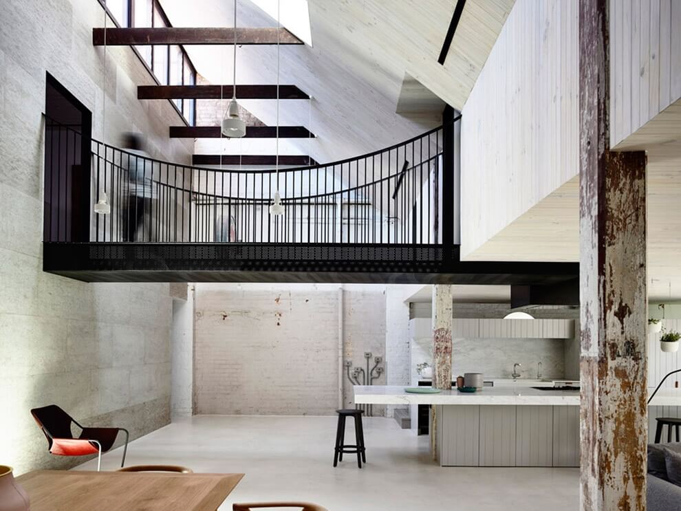
First, Architects EAT pulled out additions from the past few decades, reducing the 2,700-square-foot space to its former industrial shell. Charred beams with paint remnants were left untouched. They added a mezzanine level with three bedrooms and two bathrooms. The slightly lower ceiling on the mezzanine isn’t considered a drawback, rather, the height creates what Bo calls “a more human scale.” Three internal “voids,” or open spaces, highlight the original factory height. On the mezzanine, internal windows have slightly obscured glass, so those rooms can get both light and privacy.
For those looking for an industrial space to convert, be wary of a wall of windows. It sounds counter-intuitive that an amazing feature should raise concerns, but in an empty warehouse, the light provided by a wall of windows can be deceiving. Seeing the amount of light before partitions are built can give a sense that the whole loft will be bathed in natural light, when in reality making sure each room gets sufficient light can be a challenge. Architects EAT was able to achieve high levels of light in all the rooms by way of the voids. Since the loft is on the top floor of the former factory, adding skylights increased the amount natural light.

Communal living spaces and the screened courtyard are on the main floor. Lined with turf (and a slanted mesh roof), the courtyard extends from the living room. An internal wall of windows can be pushed flush to create a fully open space with a low bench running between the indoor living area and the outdoor lounge.
“Unlike most warehouse conversion projects, we wanted to go beyond the superficial reference to a 19th-century warehouse,” Mo explains. “We steered away from replicating the industrial rawness; instead, we designed to project modern comfort and adequacy that are in contrast to the vintage shell.” To this aim, they used black painted steel extensively, on everything from the window and door frames to the kitchen range hood. A milky lime washed timber used on the walls, ceilings and floors in select rooms adds a subtle earthy element.

The open space offered by a warehouse conversion offers room to play architecturally. One of the most unique elements of the home is a suspension bridge on the mezzanine floor that goes to the master suite. Originally, Albert Mo’s team considered a rope bridge, but nixed it for safety reasons. “The steel version still retains a certain bounce as one walks along it,” he says, adding, “We used perforated steel plates for the bridge floor to amplify the experience of height.” For Mo, it’s more than just a passageway. “The bridge is about creating a sensory experience,” he explains.
If an industrial space conversion is in your future, Mo advises factoring in improvements to insulation and acoustics. “In the old days, especially for industrial buildings and warehouses, no thought was put into comfort and livability,” Mo says. “Walls, floors and roofing all need to be heavily insulated, and the entire envelope also needs to be treated acoustically.”

To bring a level of warmth to the loft, luxe details like the saddleback leather joinery handles were added. The floor and walls in the master bathroom are clad in Calcutta marble. “It’s special, but not ostentatious,” Mo says. “The original brick wall of the factory was left untouched, juxtaposing its presence among the marble.”
And while original details were maintained throughout the space, the loft doesn’t feel prescribed. Since an industrial-influenced ethos has become increasingly popular—dictating everything from restaurant and shop design to furniture and clothing collections—overly emphasizing a space’s industrial roots can feel theme-y. Introducing sleek, modern furniture and doses of color (in this case, a rich plum, bright green and dark turquoise) helps counteract the space’s history.

As Mo explains, developing an industrial space into a home is all about creating balance. “We approached the conversion mindful of its context and historical significance. Keeping the integrity of the original factory bones was vital,” he says. At the same time, Architects EAT didn’t let the history limit the materials, colors, and function of the loft. They maintained open space while also creating intimate zones. Exciting new elements and sumptuous materials counteract timeworn walls and beams. As the loft so ably demonstrates, when it comes to industrial conversion, you can’t be afraid to put your own stamp on history.
via Inhabit

No Comments